JFK 공항 호텔 – TWA Hotel
TWA Hotel은 흔히 볼 수 있는 공항 내 호텔이 아닙니다. 역사적이고 독보적인 이 호텔은 뉴욕 시내의 5성급 숙박시설과 견주어도 손색없는 편의시설을 자랑하며, JFK 터미널 5에 자리하고 있습니다.
Eero Saarinen의 걸작인 옛 TWA Flight Center 건물을 그대로 활용해, 이전 건물의 본관을 차지하고 있습니다. 원래 건물은 1962년에 지어졌으며, 2008년에 새로운 JFK 공항 터미널 5의 일부로 편입되었습니다. 그만큼 역사적 가치는 의심할 여지가 없으며, 실제로 뉴욕시 지정 랜드마크로 등재되기도 했습니다. 그럼에도 TWA Hotel은 건물 그 자체 이상의 의미를 지닙니다. 서비스, 편의시설, 부대시설 모두 최상급이며 독보적입니다.
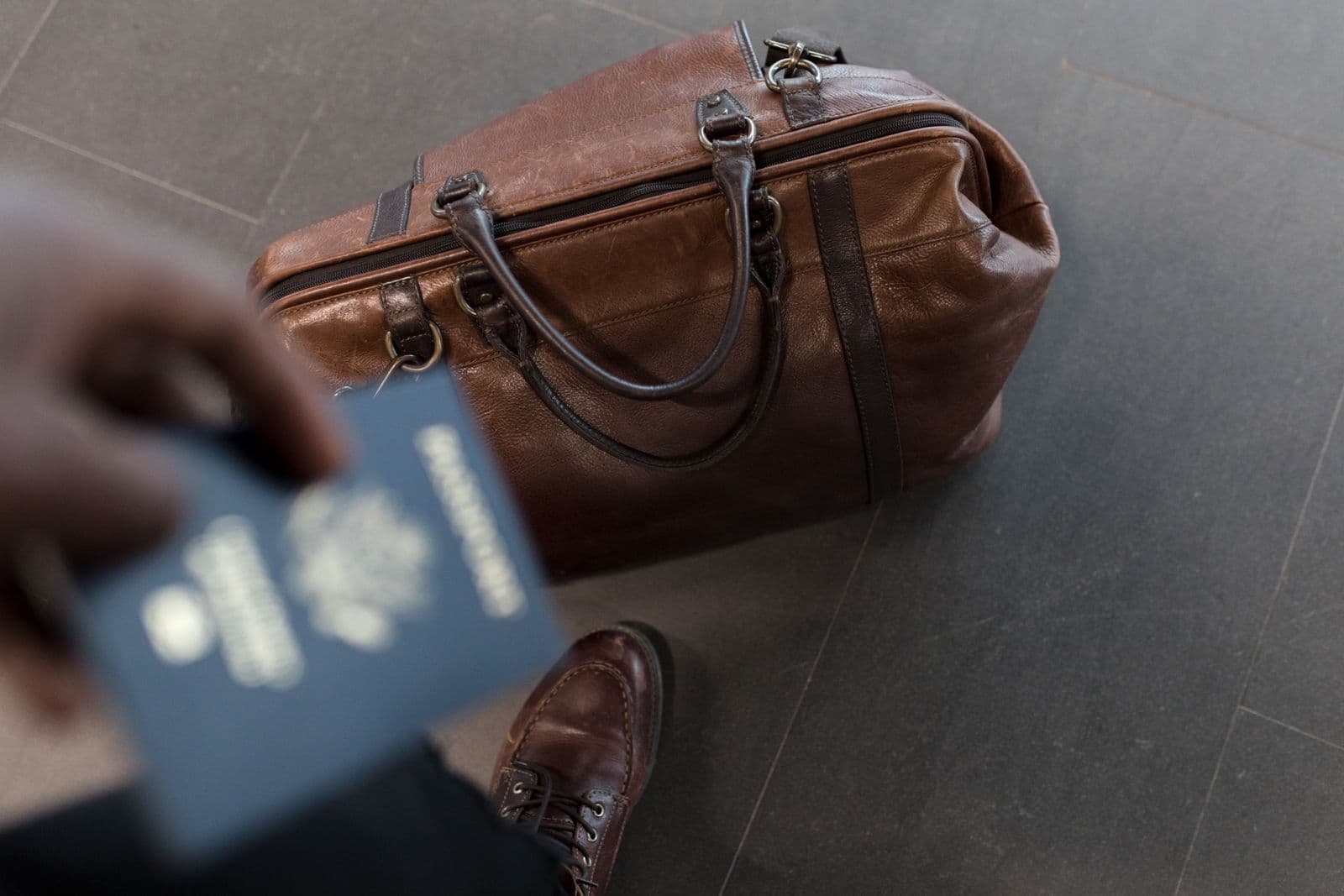
이 JFK 공항 호텔의 유일한 단점은 공항의 랜드사이드(landside)에 위치해 있다는 점입니다. 즉, 투숙객은 호텔에 도착해 체크인하기 전에 보안 검색대를 통과해야 합니다. 게다가 환승객은 호텔을 나서는 즉시 다음 항공편을 위해 다시 체크인 절차를 거쳐야 합니다.
JFK 공항 호텔의 편의시설
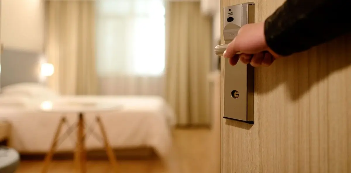
TWA Hotel의 객실
TWA Hotel에는 다양한 등급의 객실 512개가 마련되어 있습니다. 많은 객실에서 활주로의 멋진 전망을 감상할 수 있으며, 모든 객실이 뛰어난 방음 성능을 갖추고 있습니다. 프레지덴셜 스위트부터 이그제큐티브 룸, 디럭스 옵션부터 스탠다드 객실까지, 예산과 취향에 맞는 가장 적합한 객실을 예약할 수 있으며 청결함과 디자인, 인테리어 모두 만족스러울 것입니다.
JFK 공항 호텔의 식음료 옵션
호텔 내 식음료 옵션은 다양하며 시간을 들여 둘러볼 만한 가치가 충분합니다. 구체적으로 JFK의 TWA Hotel에는 다음과 같은 시설이 있습니다.
- Paris Café by Jean-Georges: TWA Hotel의 종일 이용 가능한 메인 다이닝 공간으로, 옛 TWA 터미널에 있던 동명의 유명 카페를 계승했습니다. 미니멀하고 모던한 분위기 속에서 아침 식사부터 점심, 저녁 식사, 음료까지 다양한 메뉴를 제공합니다.
- The Sunken Lounge: 호텔 로비(사실상 옛 TWA Flight Center 건물)에 위치한 The Sunken Lounge는 60년대 분위기를 그대로 간직하고 있습니다. 인테리어부터 레트로한 칵테일까지, 과거로 떠나는 타임머신 같은 공간이며 유명한 「Connie」 라운지를 조망할 수 있는 프리미엄 뷰도 제공합니다. The Sunken Lounge는 예약이 필요 없습니다.
- Connie Cocktail Lounge: 호텔의 명실상부한 하이라이트로, 1958년식 항공기 「Connie」를 개조해 만든 아늑하고 편안한 라운지이며 세계 최고의 호텔 바 중 하나로 꼽힙니다. 최대 75명을 수용할 수 있는 Connie는 예약을 받지 않지만, JFK 공항 호텔에서 반드시 방문해야 할 명소입니다.
- Food Hall: TWA Hotel에는 간편하게 식사할 수 있는 Food Hall도 마련되어 있습니다. 비스트로, 스낵바, 베이글 매장은 물론 핫도그, 아이스크림, 이탈리안 파니니, 크레페를 판매하는 여러 매장에서 간단한 요기나 음료를 즐길 수 있습니다.
- Intelligentsia Coffee: TWA Hotel의 전용 커피 공급업체는 호텔 내에 모던한 커피 바 공간도 운영하고 있습니다. 숙련된 바리스타들이 20만 평방피트에 달하는 널찍한 호텔 로비에서 여행객들에게 고품질 커피를 제공합니다.
TWA Hotel의 루프탑 수영장
TWA Hotel에는 JFK 활주로가 내려다보이는 인피니티 루프탑 수영장이 있습니다. 수영을 즐기며 공항에서 가장 긴 활주로 중 하나인 4Left/22Right 활주로와 북미에서 두 번째로 큰 Bay 활주로의 멋진 전망을 감상할 수 있습니다. 이 수영장은 여름에는 더위를 식히기에 완벽한 장소이며, 겨울에는 상시 온수로 운영됩니다. 수영장 바 역시 연중무휴로 운영되어 여름에는 시원한 음료를, 추운 날에는 따뜻한 벽난로를 제공합니다.
그 밖의 JFK 공항 호텔 편의시설
호텔에는 45개의 이벤트룸과 5개의 스위트를 갖춘 대규모 컨퍼런스 및 이벤트 센터, 7,000평방피트 규모의 볼룸(Constellation Ballroom), 4,200평방피트 규모의 볼룸(The 1962 Room)이 있습니다. 피트니스 센터는 10,000평방피트 면적을 자랑하며 세계에서 가장 큰 호텔 체육관으로 꼽힙니다.
또한 호텔 곳곳에서 New York Historical Society의 전시물을 무료로 관람할 수 있습니다. 로비부터 컨퍼런스 센터, 그리고 Saarinen이 설계해 호텔과 터미널 5를 연결하는 튜브형 통로에 이르기까지, TWA Hotel은 박물관 역할도 겸하고 있습니다. 이 외에도 Twister Room과 Photo Room이 마련되어 있습니다.
JFK 공항 호텔 주차
TWA Hotel은 24시간 발레파킹 서비스를 제공합니다. 사전 예약은 필수가 아니지만, 1시간 주차 시 약 $20(20€), 24시간 주차 시 호텔에 체크인하지 않은 경우 $65(65€), 호텔 투숙객인 경우 $50(50€)의 요금이 부과됩니다.
TWA Hotel 요금 안내
호텔 요금은 시즌과 객실 타입에 따라 달라집니다. 다만 TWA Hotel은 오전 6시부터 오후 8시까지 최소 4시간 이상 이용하는 데이유즈 예약도 받고 있습니다.
팁: 반려동물과 함께 여행하시나요? TWA Hotel은 반려동물 동반이 가능하며, 숙박당 $65(65€)의 요금이 부과됩니다.
JFK 공항 호텔로 이동하기
TWA Hotel은 터미널 5 바로 옆에 위치해 있습니다. 호텔 로비는 옛 TWA Flight Center 건물이며, 현재는 터미널 5에 통합되어 있습니다. 무료 AirTrain(24시간 운행)을 이용하면 어느 터미널에서든 JetBlue/T5 정류장까지 이동할 수 있습니다. 혼잡 시간대에는 7분 간격으로 운행하며, 터미널 간 이동에는 약 5분이 소요됩니다.
팁: AirTrain을 이용하거나 TWA Hotel에 체크인하려면 승객은 세관을 통과해야 하며, 출발 터미널로 돌아갈 때는 그곳이 터미널 5라 하더라도 다음 항공편을 위해 다시 체크인해야 합니다.
자주 묻는 질문
TWA Hotel은 무엇이며 어디에 있나요?
TWA Hotel은 JFK 공항 내 1962년에 지어진 역사적인 TWA Flight Center 터미널 건물 안에 자리한 부티크 호텔로, 현재는 랜드마크로 지정되어 있습니다. 터미널 5에 위치하며 JFK AirTrain을 이용하거나 터미널 건물에서 이어지는 실내 통로를 통해 접근할 수 있습니다.
TWA Hotel의 1박 요금은 얼마인가요?
객실 요금은 객실 타입, 시즌, 수요에 따라 다르지만 일반적으로 1박에 약 200달러에서 450달러 사이입니다. 여행 중간에 조용히 쉬거나 씻고 싶은 환승객을 위해 몇 시간 단위로 예약할 수 있는 데이유즈 객실도 마련되어 있습니다.
투숙객이 아니어도 TWA Hotel을 방문할 수 있나요?
네. 복원된 1958년식 록히드 컨스텔레이션 항공기 내부에 있는 Connie 바, 루프탑 인피니티 수영장, 다이너, 전망대 등 호텔의 공용 공간은 방문객에게도 개방되어 있습니다. 레스토랑이나 Connie 바를 이용하기 위해 반드시 투숙객일 필요는 없습니다.
제 터미널에서 TWA Hotel까지는 어떻게 가나요?
무료 JFK AirTrain을 타고 터미널 5 역까지 이동한 뒤 표지판을 따라가면 호텔에 도착합니다. 어느 터미널에서든 약 5~10분이 소요됩니다. 이미 터미널 5(JetBlue)에 있다면, 옛 TWA Flight Center 건물과 터미널을 연결하는 지붕 덮인 실내 통로를 이용하면 됩니다.
TWA Hotel에 주차 시설이 있나요?
네. TWA Hotel은 투숙객을 위한 부지 내 주차장을 일일 요금으로 운영하고 있습니다. 터미널 5에서 출발하며 비행 당일 주차하고 싶은 경우 편리한 선택지이지만, JFK의 일반 이코노미 주차장보다는 요금이 더 비쌉니다.